Advanced Shadow Boxing:
Showmanship is the keyword here. Lighting, color, and composition can make all the difference.
(Be sure to check out Beginning Shadow Boxes if you need a review.)
There is this idea of making the most with what you have. It's fine as far as it goes, but it has a feel of poverty and deprivation though. Taken up a notch, there is the idea of showmanship. Means making what you have look like more'n you have. Have you seen those pictures that float around the net that show women before they are made-up? They are not unattractive women --they look like our wives, sisters, and... well... they look like regular women. Then their hair is all fussied up and all manner or foundations, blushes, and paints and I don't know what all is applied. AND THEN, someone takes the picture and puts it in a computer and fixes it more! WOW! But if you look at the before and the after side-by-side it's just barely believable that they are the same women. Now this is showmanship.

It's also no more -nor less- then any good museum exhibit designer or department store window decorator, or theatric set designer does. All of these folks -and this includes the person who makes you want to run out and buy the clothes the pretty woman is (almost) wearing- have light, color, and composition in their tool boxes. No reason you ought not have the same tools to make your collection stand out.
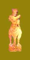
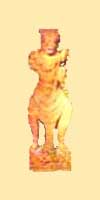
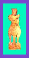
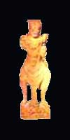
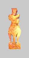
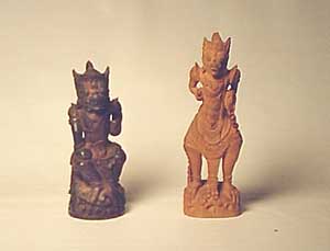 Here is where we start. Two little figurines of what I think is the King of the Monkeys from Indonesian folklore. The red one is about 7" tall and the the dark one is 'bout 6. They are hand carved from some sort of tropical wood. I suspect they were either purchased -possibly from the guy who actually carved them- by someone traveling in that part of the world as a souvenir. Or maybe there is whole village of wood-carvers and someone imports them to America. Point here is that their cost is problematic, but certainly not very high. I bought both of them at the flea market for a few bucks. I don't think I over paid. But cost and value are different things, aren't they? Now my task is to make them look like rare and valuable collectable items. Here is where we start. Two little figurines of what I think is the King of the Monkeys from Indonesian folklore. The red one is about 7" tall and the the dark one is 'bout 6. They are hand carved from some sort of tropical wood. I suspect they were either purchased -possibly from the guy who actually carved them- by someone traveling in that part of the world as a souvenir. Or maybe there is whole village of wood-carvers and someone imports them to America. Point here is that their cost is problematic, but certainly not very high. I bought both of them at the flea market for a few bucks. I don't think I over paid. But cost and value are different things, aren't they? Now my task is to make them look like rare and valuable collectable items.
|
LIGHT:
Can you really trust your eyes?
|
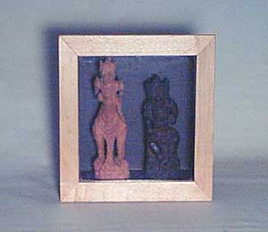
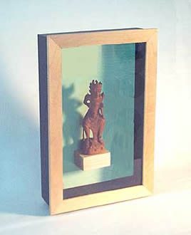
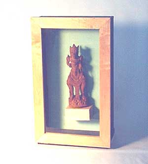
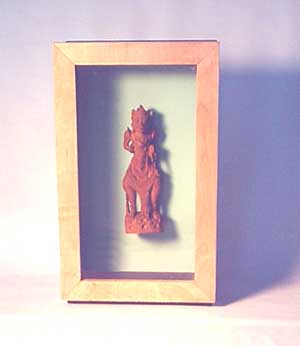
This is our control -the starting point for the topic of light. A shadow-box with a maple frame and a black box that's 8" x 8" x 4" deep. Light is simple room light -the pros call it "ambient light." Problems are obvious -the dark monkey is all but invisible against the black background. The red one ain't too happy either.
But don't give-up on black backgrounds -it has a place and is probably the most dramatic background there is. Here is how to make black work
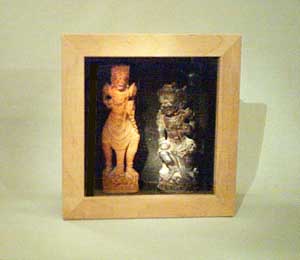
This is what it would look like with a single spot-light from above. The black guy has shown up very enthusiastically. Easily done with the shadow-box at eye level on the wall and an adjustable spot on the ceiling. Don't let this frighten you -it may be easy to change a single ceiling light to a track with 3 or 4 high intensity directional lights.
Admittedly, this effect is more dramatic after dark, but if you are careful to protect your collection against UV Light, it may be that the room where you keep your collection is dark enough -even at high-noon- to benefit from ceiling mounted lights.
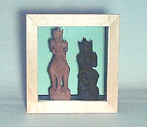
Another possibility is to put a contrasting color behind the object. (More on colors shortly.) The problem is that while the dark monkey shows up -you still can't see any detail. But hold on here! Put on your showman's hat. It may be that you are creating some mystery and inviting your audience to step closer and figure out what they are seeing. (This shot is also lit with ambient room-light.)
Now you know why they are called shadow-boxes! This is a simple piece of the same green card-stock paper as above. It's cut to the same height as the box's interior, but cut long. Makes a dramatic arched background that is super easy to do. Then it is illuminated with spot-lights from both sides and a little lower then the box. Sadly, spotlights -particularly spots at a level lower then the ceiling- are more difficult then a paper background, but for some collectables, it might well be worth the effort.
Color:
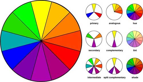
Our friend -the color wheel! Strikes me that people who understand the color wheel spend a not inconsiderate part of their lives trying to explain it to people who don't understand, don't care to understand it, and probably will lead the rest of full and productive lives without EVER understanding the color wheel.
Not unlike the people who try to explain the difference between 'affect & effect', or how catalytic converters work, or my personnel hang-up- the difference between or "square" vs. 'fore-aft" rigged sailing ships. But I digress.
There is stuff to be learned form the color-wheel that can be easily used in making a killer shadow-box display. Lets get through the dull stuff quickly -it's mostly vocabulary anyway. The first column describes the primary colors -these are colors that are used to make the other colors -the secondary -the one between (mixed-up out'a...) the 'primaries,' and the ones between the 'secondaries' -the 'tertiaryies,' or the 'intermediates' as the chart has it. The middle column describes combinations of colors. Think of 'complimentary" as opposites. The split 'compliment' is sort of a fancy opposite.
The third column is perhaps the most interesting. It shows pure colors, 'hues' and then these colors with white added. If you are hanging out with artistic types, you need to call them 'tints' and the pure colors mixed with black are called 'shades.' If you are talking to ordinary folks, you can call 'hues' 'pure.' Call 'tints' 'pastel' and call the 'shades 'shades' (Shade seems to be the only word that works. 'Deep' almost gets it, but deep blue -for example- may be a pure primary or a navy-blue -which is actually a shade of blue. So be careful.*
Take a good close look at the shades from yellow-orange to red or even purplish-red. This is where what we call the 'browns' live. Wood, dirt, people, and people's hair are all made out of shades of red and it's analogous colors. It's just easier just to say 'brown." The last two columns hold the secretes of good color co-ordination.
HOW TO DO IT:
For starters, you need to understand that there are people who do all of this instinctively. For such people, the following would likely elicit a response like "Well obviously!" or "What's your point?" These people are called 'women.'
For everyone else, it takes a little thought. And even so -if you decide some collectable item against a background of some color / shade / pastel just looks right and you -by gosh- like it that way, you are done. Entirely possible you may have had the benefit of one of the aforementioned 'woman' sometime in you life. One who taught you well.
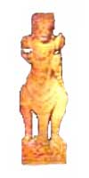 We begin with our little reddish monkey. It is a bit tricky to look at a shade and see the underlying color, but with practice, it gets easier. This little guy is actually a basic (secondary) orange. We begin with our little reddish monkey. It is a bit tricky to look at a shade and see the underlying color, but with practice, it gets easier. This little guy is actually a basic (secondary) orange.
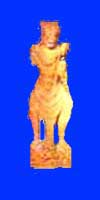 This is a simple compliment -orange and pure blue. Not half bad, I think, and what could be simpler? This is a simple compliment -orange and pure blue. Not half bad, I think, and what could be simpler?
 The background here is a shade of the color of the monkey. May not look like like orange -a shade or otherwise -but trust me -I used expensive photo software. The background here is a shade of the color of the monkey. May not look like like orange -a shade or otherwise -but trust me -I used expensive photo software.
 Same thing, only completely the opposite. Exactly the same hue as above, but a pale pastel. Same thing, only completely the opposite. Exactly the same hue as above, but a pale pastel.
 Compare this to the compliment above. This is the famous split compliment. Start with an orange object, cross the wheel toward blue and kind of split off to purplish blue and blue-green for the background. The one below is also a split, but it splits the monkey into an analogous yellowish orange and a reddish orange. Then we cross the color wheel to get to the complimentary blue. Compare this to the compliment above. This is the famous split compliment. Start with an orange object, cross the wheel toward blue and kind of split off to purplish blue and blue-green for the background. The one below is also a split, but it splits the monkey into an analogous yellowish orange and a reddish orange. Then we cross the color wheel to get to the complimentary blue.
  Don't forget black. Good color black. Very dramatic. I'd be a little hesitant to use white. Nothing wrong with white as such, but it tends to make light color things look yellow or dirty. Or even worse -the white may look yellow. Or may actually turn yellow with time -particularly if you use cheap paper, paint, or fabric. Grey is often the better choice -even very light gray. Don't forget black. Good color black. Very dramatic. I'd be a little hesitant to use white. Nothing wrong with white as such, but it tends to make light color things look yellow or dirty. Or even worse -the white may look yellow. Or may actually turn yellow with time -particularly if you use cheap paper, paint, or fabric. Grey is often the better choice -even very light gray.
COMPOSITION:
Composition involves things like symmetry and balance and such. I actually cover the subject pretty well, (I think) in my article on Using Riker Mounts. There are just a few things I need to add specific to shadow- boxes.
Have a close look at our old friend above. Two almost identical displays. Same monkey carving. Same little block of maple for him to stand on, (see bellow for how to do this.) Same green paper background. The only difference is that one shadow-box is a size bigger. The one on the left is 10" x 16" and the one on right is 8 x 14." Did you notice? If you did, you are more perceptive then most folks. But here is the thing, if you are like most people, the one on the left looks more "valuable." This is part of what I mean by showmanship. In Texas they say something like "Big hat, no cattle." True as far as it goes, but in our world, we say "The bigger the display -the more important the collectable."
Here again is the same monkey and the same smaller box as above, but now the monkey is standing on an invisible anti-gravity shelf. Actually, he has a piece of fine wire poking through the back and paper, wrapped around his chest, and poked out through the back again and twisted into a knot. I used steel wire because that's what I found and it is suitably invisible, but copper wire would have been even more invisible against the orange carving. Mono-filament fishing line would have worked better yet.
The only thing to keep in mind here has to do with whether or not you want people to open the box, take the thing out and fiddle with it. If so, the shelf is the way to go. If you don't want it to be handled, wiring it into the box is obviously the way to go.
Additionally, our monkey has a base and could stand there on his own. Makes the shelf an option, but not the only option. He looks pretty good on his invisible anti-gravity shelf I think. Some items -those without bases / stands / supports, need either simple wire(s) or elaborate supports that you may design and build. Without my advice -and good luck to you.
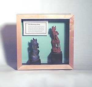
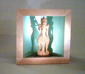
Here we see our red monkey rejoined by the slightly shorter black one. The shadow-box is 14 x 14" and -yep- that's the same green card-stock in the background. Lighting is a spot from above -as it would be if the box were at eye-level and you were to replace the ceiling light with some track lighting and a high intensity spot.
The little boxes they are standing on are the super easy card-board ones I describe in Easy Home-Made Display Stands. Finally, note the narrative. It is mounted on a piece of foam-core, (but card-board would do as well), and is raised off the background about a half inch with a couple of layers more of foam-core or cardboard. Makes all the difference when it comes to making a flea-market find look like a valuable collectable.
Shelf HOW-TO:
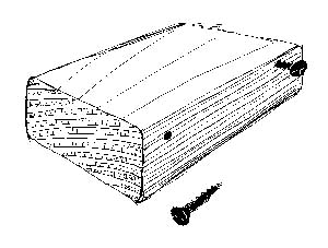
Nothing easier. Get a block of wood with some heft to it -a 2x4 for example. Cut it to an appropriate length. Drill two holes through the back of your shadow-box, -or order one from me with a peg-board back. Hold the block about where you want it and mark the block to reflect the holes. Move the marks to the top 1/3 or 1/4 of the blocks thickness and drill an appropriate hole for the screw you are using. (F'rinstance, 1" sheet rock screws countersink themselves very nicely in peg-board and work well with a 1/8" screw hole. Use a size larger drill-but if you are working with a hardwood like maple or oak.
Other things to check out:
Fabric comes in a nearly infinite variety of color and texture. Check out A visit to the Fabric Store
To lift up a extra special item, you might want to know How To Make Simple Display Stands
If all the above stuff on color hasn't frightened you and you really want to dive into the subject, check out Simple Faux-finishing Techniques for the Collector
Finally, don't forget my first article (for beginners) on Shadow Boxes .
* Know how professional graphic designers do it when talking to their printers, for example? They refer to a specific color from an expensive flip book that looks like about a million of those little cards you find in the paint store with 5 color samples. If it is REALLY important -they describe the color in terms of wavelength, transmissness, radiance, and all manner of things that sound like a graduate physics class.
|